

As you might know, I’ve been working on a redesign of my websites lately. One of the things I wanted to make sure I do properly in this iteration is to ensure proper display on both desktop and mobile. You would ear often that should design your website for mobile first, and I would disagree. A website should be designed for where it is going to best serve its purpose. For portfolio website, there is no doubt we would rather have them displayed on desktop than on those tiny mobile screens. However we must also acknowledge that we have little control over where and when our pages will be displayed and in these days and age 55% of page views come from mobile phones.
So, what are some nice things to consider on desktop, and how do these differ from what you would do on mobile ?
Accommodating phone users
Screen orientation
The first thing to consider would be the overall layout and here on PC we are generally dealing with a 1920 * 1080 screen resolution, with internet windows being displayed most of the time at that resolution or at least large enough and almost always oriented horizontally. I like it this way, I think this is a format very well suited to present art and I wouldn’t like it messed-up in any ways.
But there comes mobiles phones and they come in all sizes, are used vertically most often, and they are tiny. But I have good news. We do not have to sacrifice our entire design to fit a portrait display where it has no business being displayed. All we have to do is prompt the user to reorient their phones before we display the website.

On the developer side, this drastically reduces the number of weird layout de-figuration we have to take into account, and in doing so it ensures a good viewing experience for the visitor. This is a win-win situation. It might also make it clear that the website is intended for the big screen first, and might prompt some to go sit at a desk before viewing (inshallah).
Screen size
But for those that stay on their phones ; mobile screens can go quite small. This means we should make sure than none of the main features are sized too small. A thumb must easily be able to “click” our interactive elements.
For instance I have this tiny navigation menu on the top left corner.
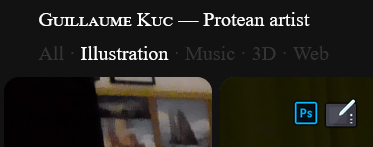
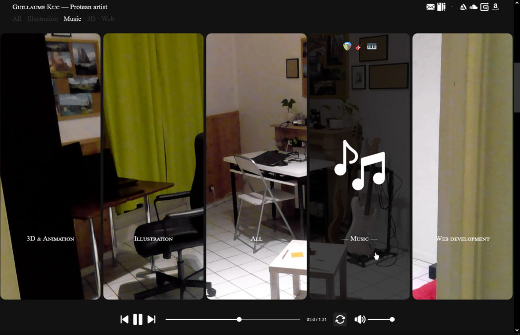
This would be very cumbersome to access on mobile. Fortunately I have also set-up this huge full page version of the same menu first thing after the splash-screen. The user can always scroll back to it to switch between the different rubrics instead of using the left corner menu. It is also an opportunity to design a nice looking page and ease-in gently into the core content so nothing is lost !
Thumb position
We also need to consider the length and location of thumbs relative to the screens. On desktop we have a tendency to put all our menus on the top but it is not optimal for phone users. Indeed, thumbs are not that long and are located on the bottom right corner of the phone (for a right handed person). This means important navigation items should rather be placed in the bottom.
There is no :hover on mobile !
One last thing we might not have thought about. There is no :hover on mobile since there is no mouse. You are either clicking or dragging or you are in fact not interacting at all with the website. This can mean a lot of information might be lost in translation when switching to mobile. Indeed :hover effects tend to add a lot of life to a website. On this page for example, we light-up reveal the images by hovering them on desktop, but here on mobile, without any change we would go straight to the next page when clicking on them without a change to get a clear view of any of them.
The solution I implemented was to turn my click action into a double click action and to apply my hover effects after a simple click.
Optimizing for keyboard navigation
There is one feature I put a lot of care for the desktop version of my website and that is key navigation. It felt very important to me that this website should be browsable with the arrow keys alone. Keys generally feel easier than the mouse because they require no precision at all ; the hand is comfortably resting on the arrows and isn’t moving much at all during the entire process. The idea is to just lay back and watch some works. The layout I chose reinforces that idea by essentially stacking a pile of sheets vertically and having them feature horizontal galleries. Those two axis : vertical and horizontal match perfectly the arrows our keyboards come equipped with. This is very much intended this way.
One thing that had to be done was to let the visitor know that he or she could use the keyboard, and I tried not to be too oblivious about that. On my pre-screen, in place of a “Get in” message or some other flavor of a welcoming prompt, I used an enter-key shaped “Enter” message to hint at the fact that the key could also be used in addition to click-based browsing.

I also dropped an other down-key shaped icon on the splash screen, to hint at the fact that yes, we could scroll down to see the works, but also that we could do so using the down arrow key. With this hint and the previous one, my hope was that by this point the user’s hand would be anchored to those arrows and he could take it from there.

It’s like a mini tutorial and now we are ready to play by ourselves. The next screen features no hint at all but of course the arrows can be used to select among the various rubrics. After that it’s all supposed to feel intuitive. Easy and fun. The mouse always remains available of course.
One difficulty is to be able to switch back and forth between key and mouse navigation. On the developer side, this means keeping track of our location in the tree structure at all times and updating the relevant variables so that when we go back to key navigation after some mousing, we are moving from where we are rather than where we were before we did the mousing. It is all very worthwhile I believe, key navigation is fast and fluid. I love it very much.
So after those few considerations, if I could say it all in one sentence :